Proposals: PHPcrawl
These images were proposed for, and accepted by, the PHPcrawl open source project,
Click any image for a larger preview.
01. Initial Logo sketches
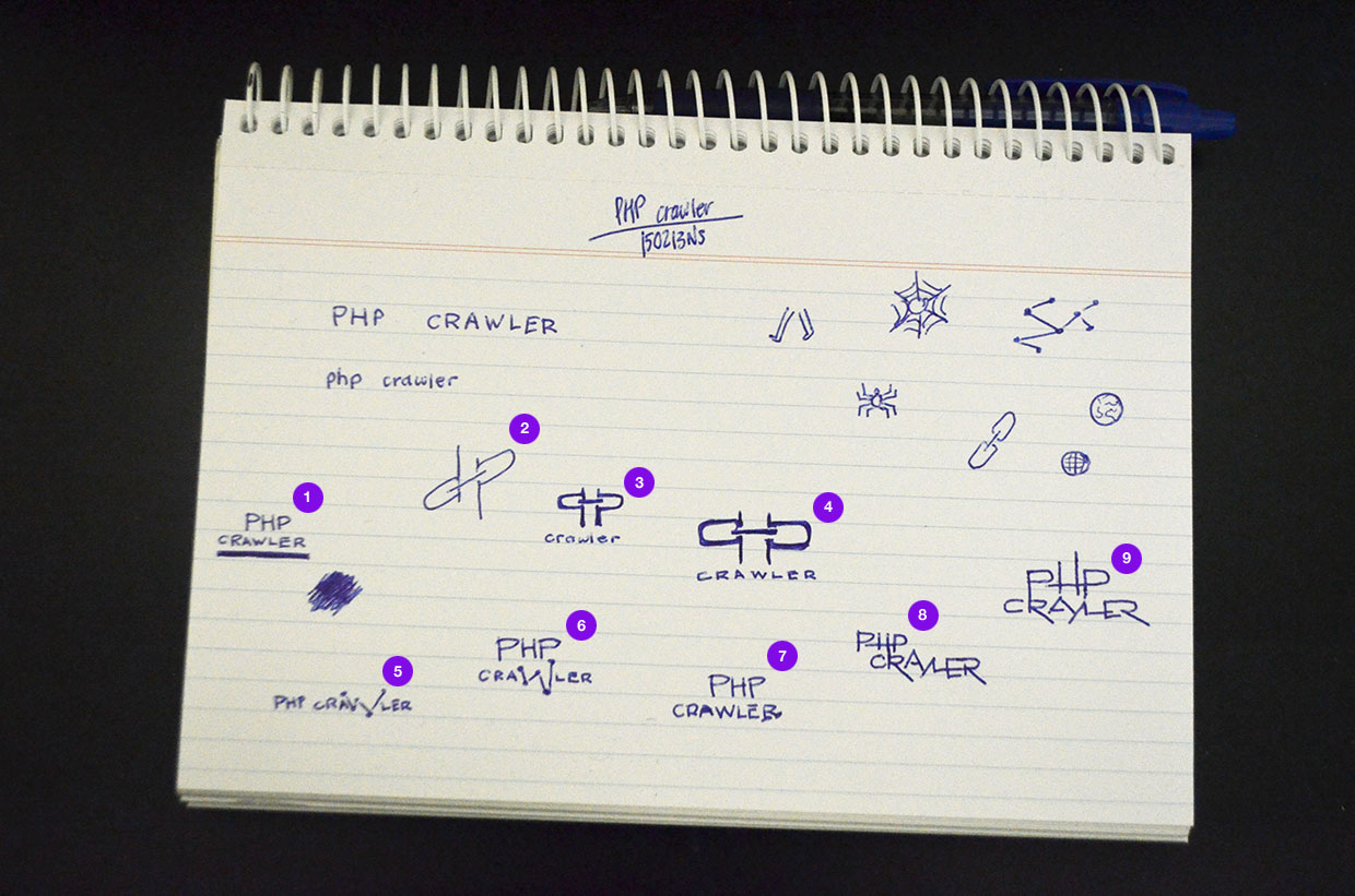
A number of pen&paper sketches to start off getting a feel for what style and symbology was preferred;
02. Refined Logo proposal
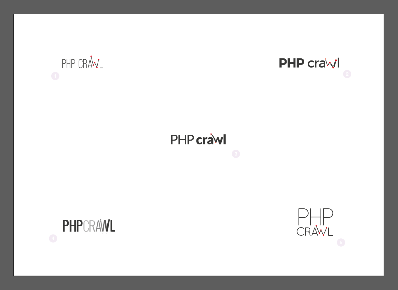
I moved to vector and narrowed down the options after the client selected sketches 05 and 06 for further development. In essence, the dea of the W portraying a jumping path between servers was the most promising concept in the chosen proposal.
"This time I've taken inspiration directly from the videos you linked to, particularly the blue glow of the nuclear reaction. I've abstracted the previously square nodes which were structured and ordered in a matrix grid to form the name "Scram" in the old logo into a frenetic array of "escaping" energy."
03. Spacing accomdoations and variations
The client chose proposals 02 and 03 from the above and requested more attention paid to spacing (tracking) and case. Given the decisions, I moved the proposals forward to include colour and slight variations in the "jumping bot" treatment.
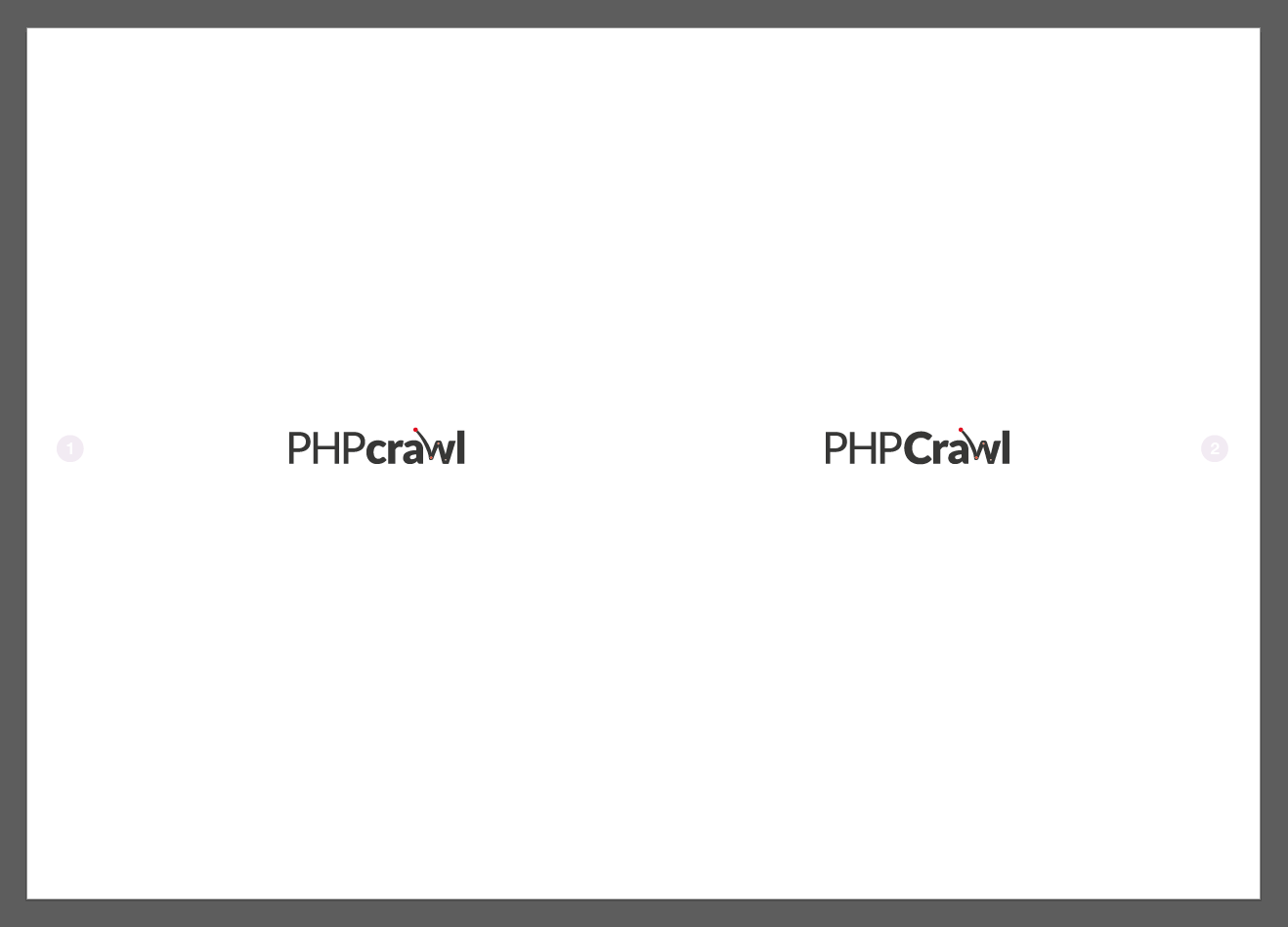
Varying the casing of the "C" in crawl as requested.
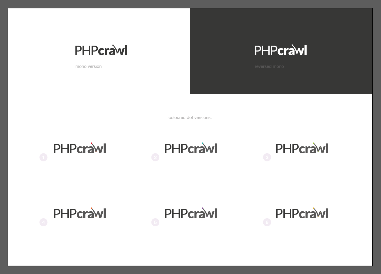
Difficult to make out here, but progressing to mono and coloured versions of the dot "nodes" and "path" apparent in the w.
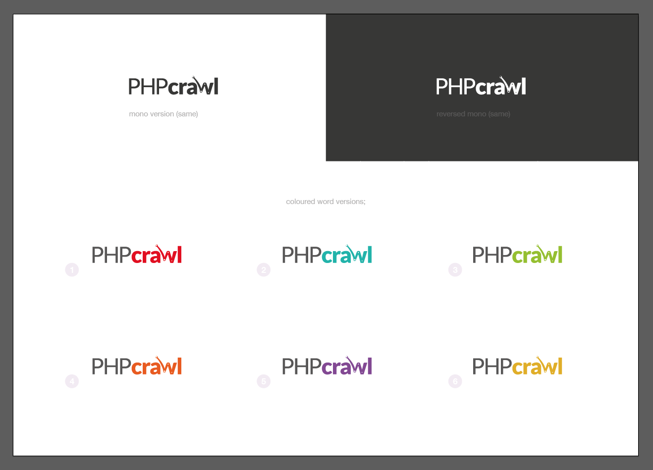
Exploration of expanding colour use in the wordmark. This was deemed less desirable.
04. Flat and gradient comparisons
A very subtle coloured (and graded) swoosh is introduced to the initial path of the w.
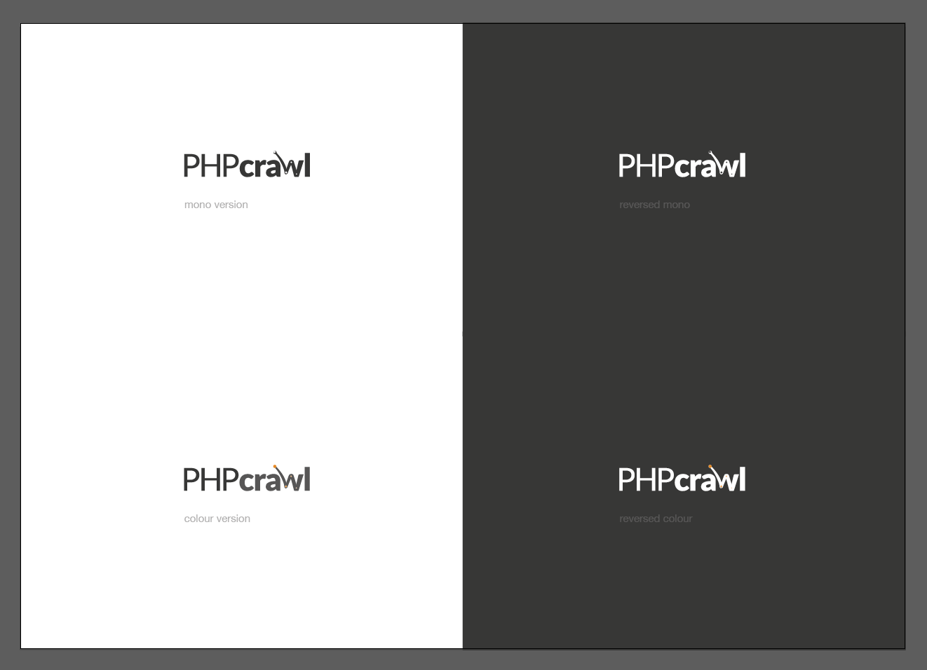
Without the graded initial path.
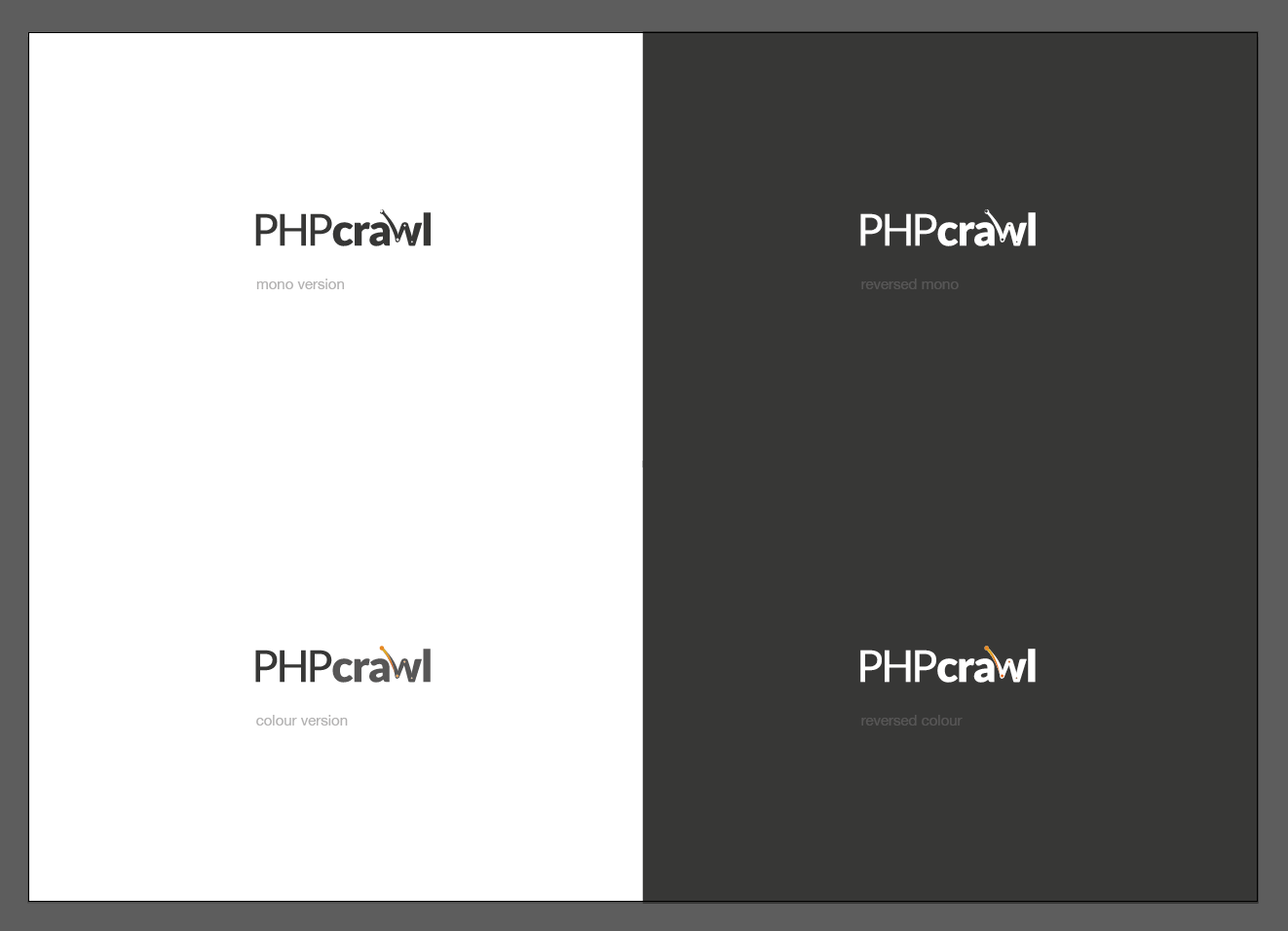
With the gradient.
05. Logo approval and Brand guide
status: approved
Approved by Uwe HUNFELD on 2015.04.25 by Email.
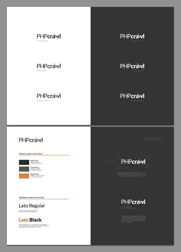
This is a preview of the condensed two-page Brand Guide in the above pack;
