
Proposals: ExBin
These images are proposed for the ExBin open source project's consideration,
they are not official ExBin Designs yet (fingers crossed though).
Click any image for a larger preview.
01. The Main Logo
A proposed logo for the ExBin project;
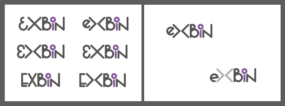
"All the letters are custom made to try and create a good balance of letters in equal balance. The lowercase "i" is the real drawcard for me (which is why I've accentuated it here with colour, but the choice of colour is just for demonstration, feel free to ask for changes to the colour). The reason is that by reducing the letter i to its components we get both a circle and a line, or a zero and one... BINARY BABY! =)
I've also tinkered with having the X broken into an opening and closing markup bracket, but feel free to let me know if it's gone too far? Personally I think the lowercase e helps with framing and balancing the logo, but I know capitallisation of certain letters in project names is a sensitive matter, feel free to push back in that regard as well."
02. Logo Refinement
Second round of logo proposals for the ExBin project;
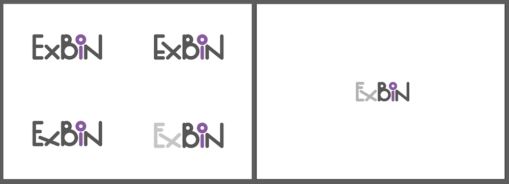
Reigning in the previous examples that broke the project's ExBin capitalisation. In order to prevent some of the stagnation evident in the top left version, the x has been given some deviation (like the N) to make the composition less conventional. This could be a good or bad thing depending on whether the brand is meant to convey regularity or eccentricity. In either case the main "concept" behind the logo (of the i implicating binary 1 and 0) is intact. The brackets forming the x have been removed from the previous examples, the far-to-obvious reference to XML syntax might be stretching it. One letterform concept is enough without going overboard. The letter colour differentiation though is meant to break out the Extensible/Binary components a little. Click above for larger preview.
03. Colour
logo proposals colour variations for the ExBin project;
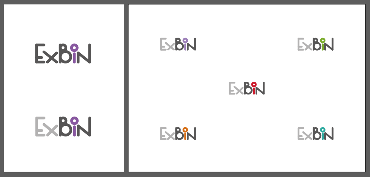
Five colour variations for the focal point of the logo, the Binary "i". The top left version is a slightly paler purple than the existing placeholder-Purple. Some colours are highly competitive and dominate the logo while others are more washed-out, but this is a highly preference-based decision. Here is a wonderfully succinct resource about colour associations (cultural and gender effects) that is more credible than most colour articles on the web, in case you're having a tricky time deciding =)
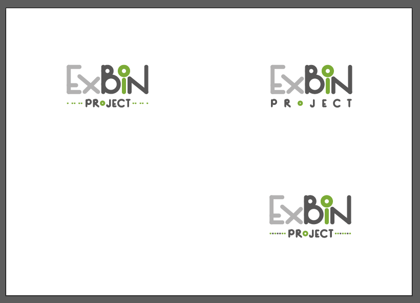
04. Secondary logo variation
A variation to the primary ExBin project logo;
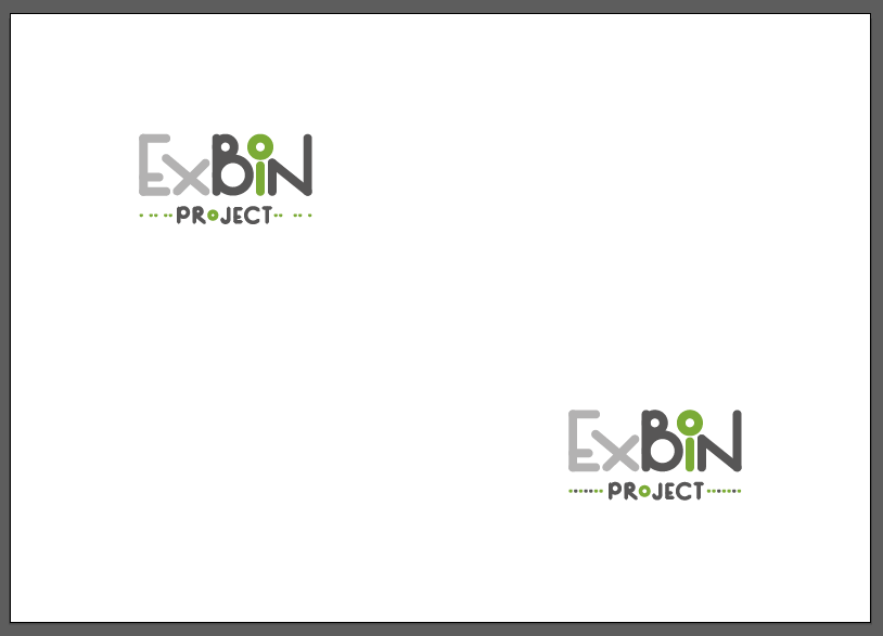
With Green selected as the project's brand colour, this second variation of the logo is meant to appear in any material where the ExBin project is being introduced and is not known to be a project rather than company. Both dotted lines are meant to evoke associations with on and off states. The top-left does this with form while the bottom-right does it with colour. And below, this one corrects the top-left dots spacing error and includes a version with evenly distributed characters for "project";
05. Final selection
The two variations chosen for the Exbin project logos;
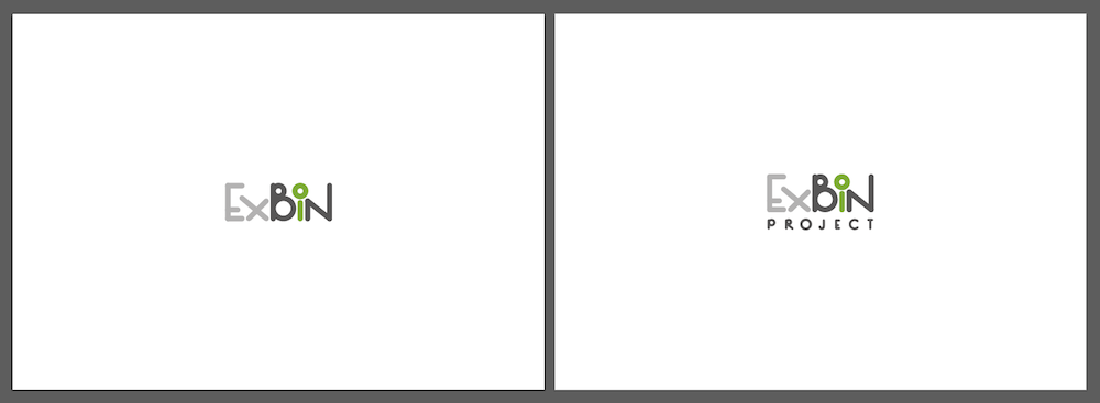
The above two were selected as being the final variations of the ExBin project logos. They discard with the dots and coloured o for reinforcement. The left version is for use on the website and all internal material (without the word project) and the second for any uses introducing ExBin as a project rather than product, such as introductory video covers or slide-decks.
06. Logo Pack
status: approved
Approved by Miroslav HAJDA on 2016.08.03.
A final package of the brand guide (below) and font, the CC license, and of course the logo wordmark (alone), the subtitled version, the dotted-subtitled version and all three versions a)inverted, b)in mono and c)in full-colour alternatives as;
- EPS-vector
- hi-res-PNG-raster and
- SVG-vector formats
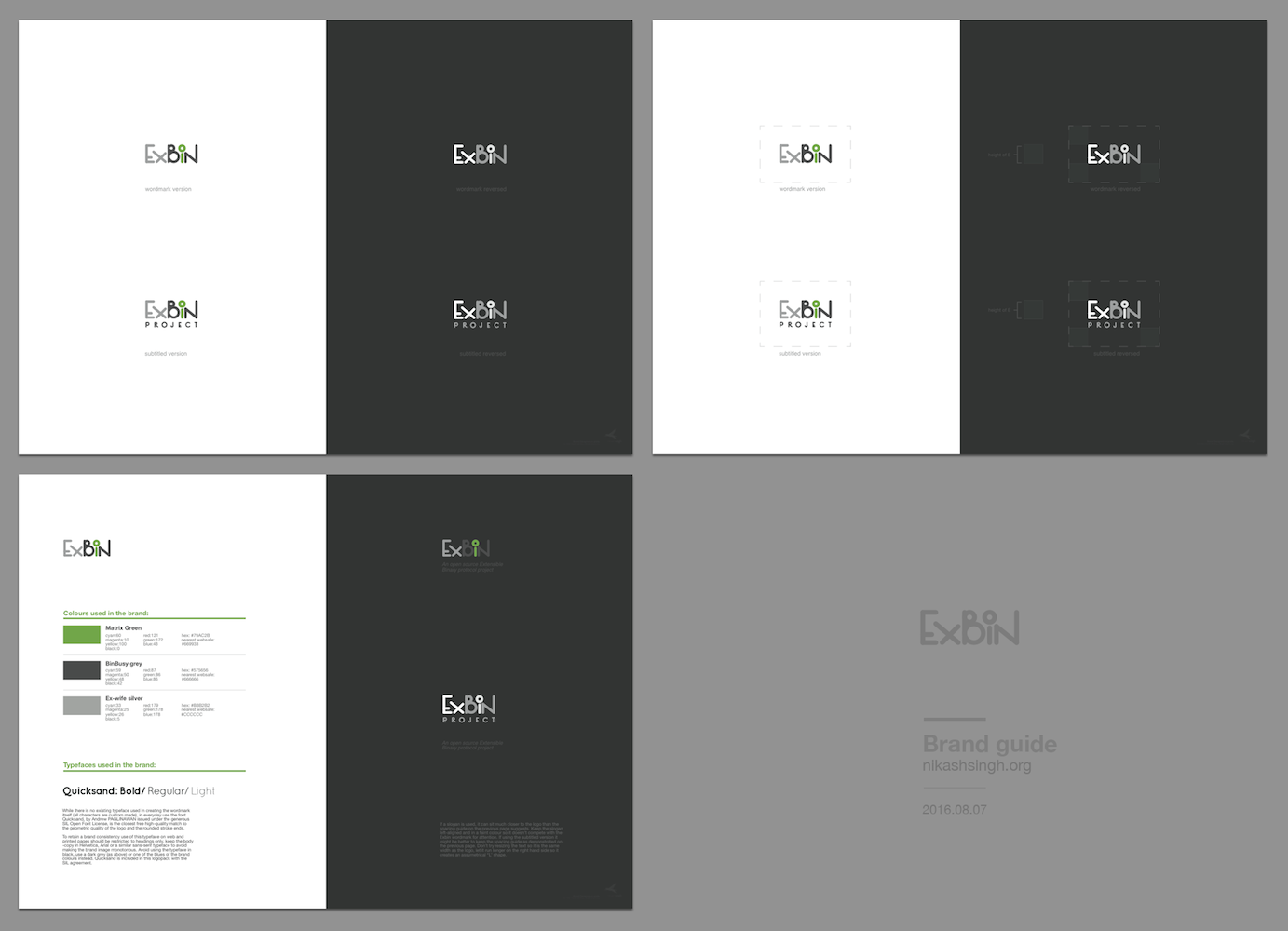
07. Brand Guide
A short document with recommendations on implementing the ExBin brand consistently.
View the ExBin Brand Guide document here.
The document is part of the logo-pack download above.
A preview is visible below;
While the brand-job is finished, the discussion continues here =) ;
https://sourceforge.net/p/forge/helpwanted/artists/thread/82a7a982/
Nik