Proposals: SecureX
These images were proposed for the SecureX open source project's consideration.
They are now the official SecureX Designs.
Click any image for a larger preview.
01. The Main Logo
A proposed logo for the SecureX project;
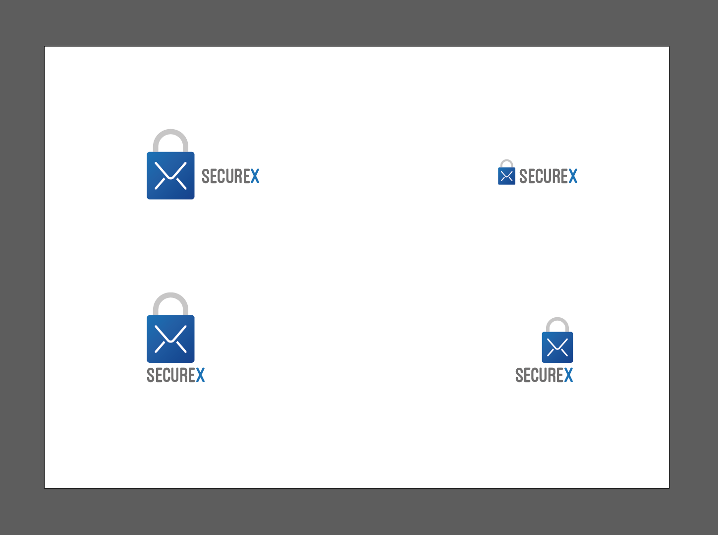
"It takes the idea to use the message/envelope folds as the "X" in secureX and a padlock symbol which is a well-translated (culturally) symbol of security. The colour used is blue (psychological underpinnings of safety and trust but colour being a subjective quality that is up to you and your tastes. The typeface is a liberally licensed free font and it's clean rectilinear edges echo stability while the rounded edges reinforce the aesthetic of the padlock symbol (softened and rounded to lessen the "corporate" feel, which would further be lessened by adopting a colour other than blue). There are a few compositions on this page, personally I think the bottom-left version prevents the type of stagnation perfectly symmetrical logos suffer from"
Suggestions? Thoughts?
Let me know what you think.
Nik
02. Logo Pack
status: approved
Approved by Alexander VDOLAINEN on 2016.05.19.
A final package of the top-right version (horizontal logo), the bottom-left version (stacked logo) and both inverted in;
- EPS-vector
- hi-res-PNG-raster and
- SVG-vector formats
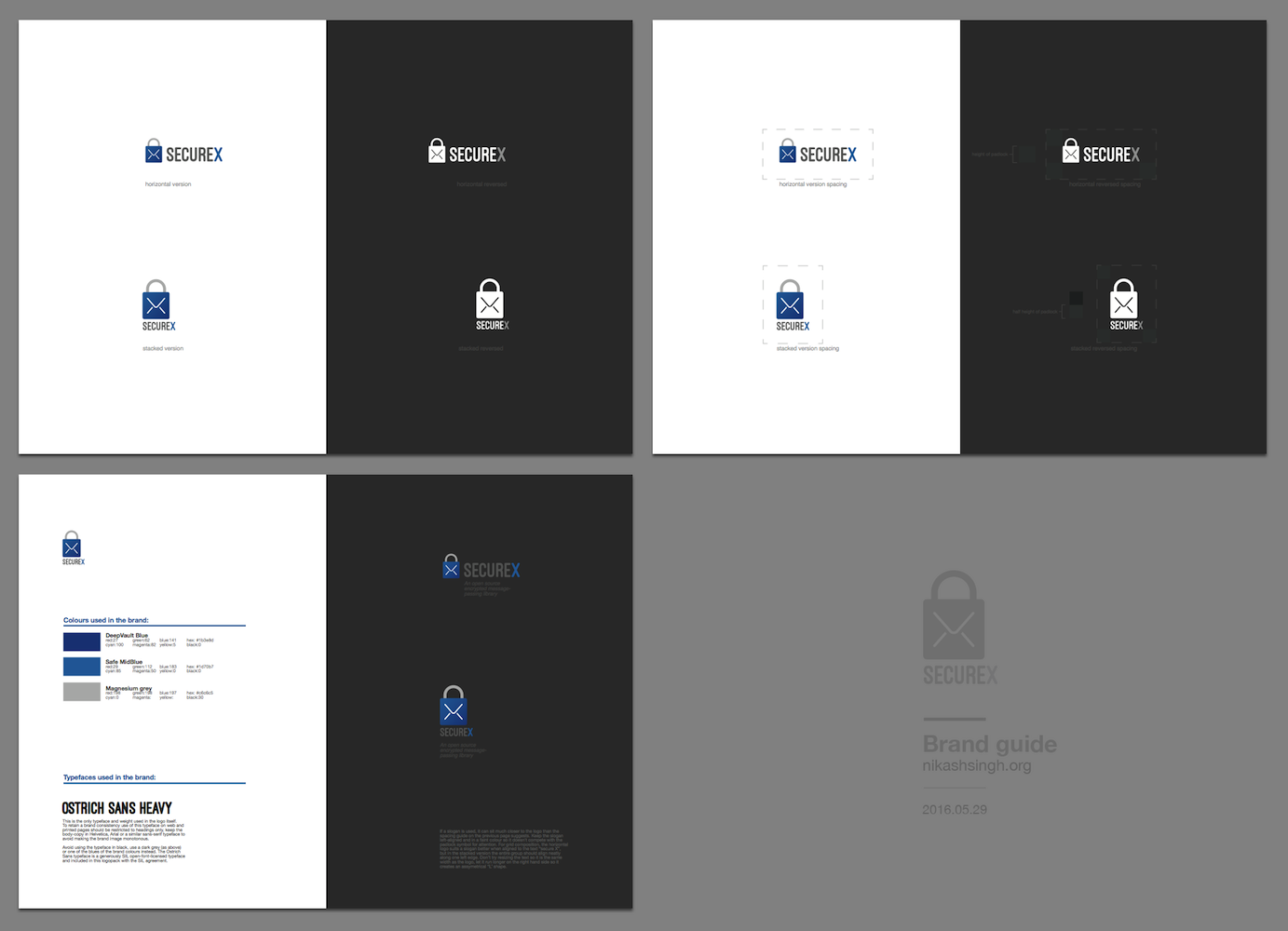
03. Brand Guide
A short document with recommendations on implementing the secureX brand consistently.
View the Brand Guide document here.
The document is part of the logo-pack download above.
A preview is visible below;